Commentary
CPKC: New Railroad, New Livery
Written by William C. Vantuono, Editor-in-Chief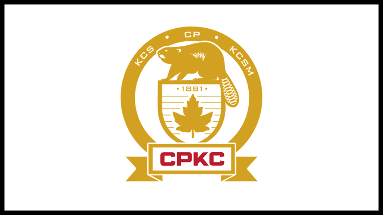
Locomotives are the public face of a railroad. The most attractive liveries reflect not only a company’s heritage, but the communities it serves. It is a symbol of pride. In some cases, it symbolizes a connection with a nation.
It must have been difficult for Canadian Pacific Kansas City to produce a locomotive scheme that not only reflects the heritage of two iconic railroads, but the fact that this railroad, unlike any other, links North America’s three nations with single-line, transnational service.
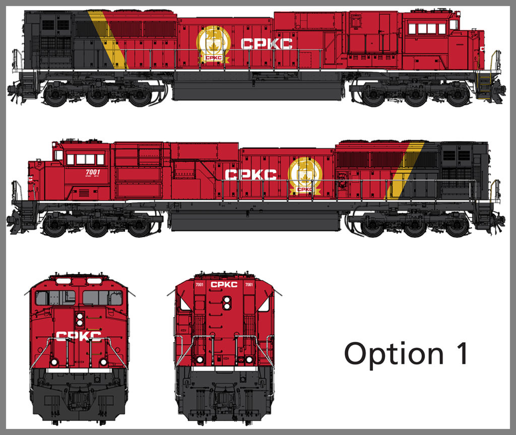
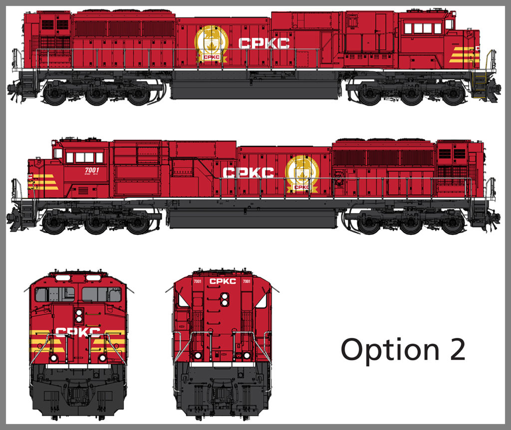
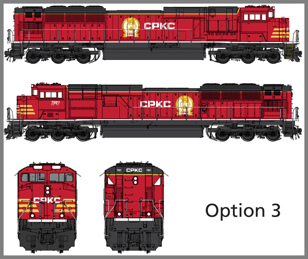
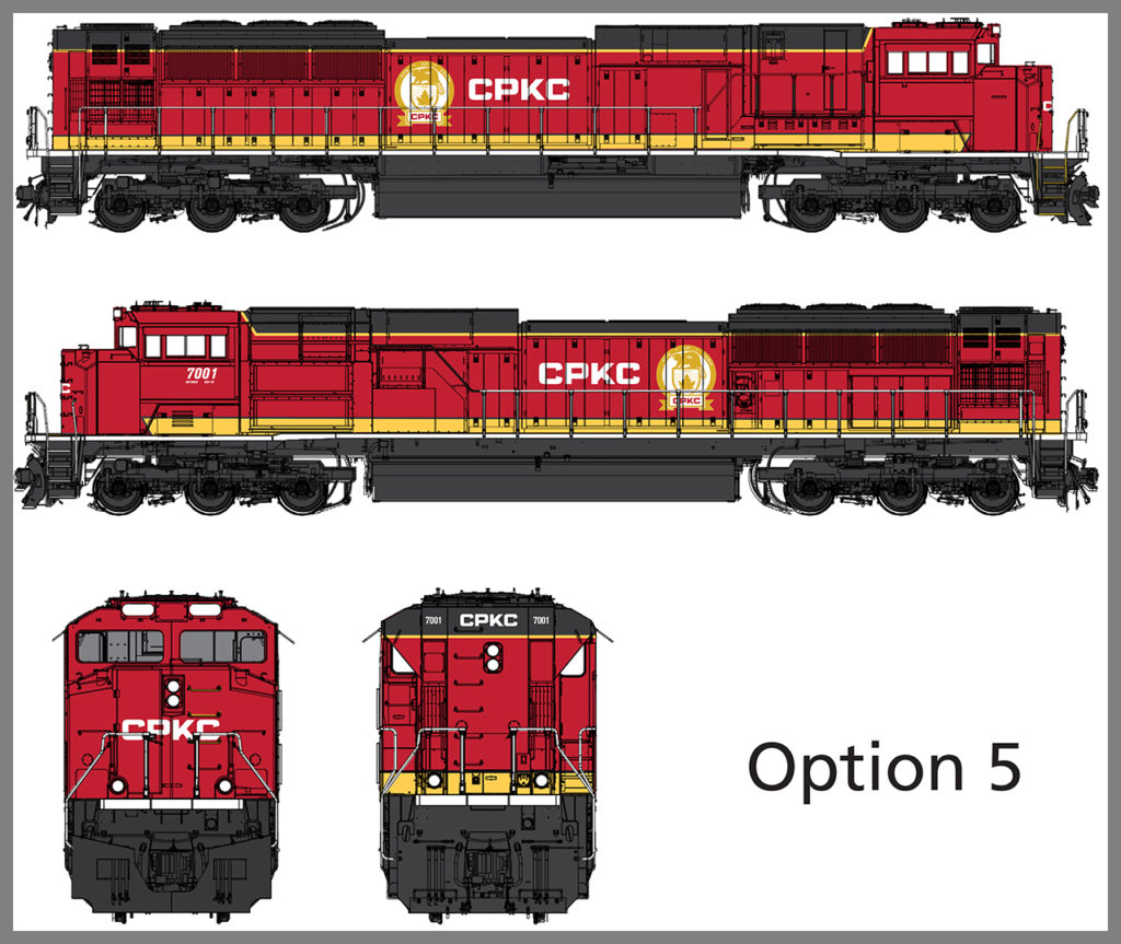
The five CPKC options displayed here resulted from the work of an internal design team, with direction and focus provided by President and CEO Keith Creel, who felt it vitally important that the employees have input into what their rolling flagships should be displaying. “I want our railroaders to feel that they are a key part of this process, designing a new paint scheme,” he told me not long ago. “I think that what we’ve come up with here, and how we’ve gone about selecting the final scheme—providing options for our railroaders to vote on—reflects our commitment to them as a company, and helps promote a feeling of unity. There was a lot of excitement, a ton of energy, centered on developing a new CPKC livery.”
Once the five options were finalized, they were presented to all CPKC employees through an internal survey. Thousands of votes have been received and tabulated. The winning scheme will be revealed sometime this summer.
There are common elements in each design. Essentially, they are variations of a theme that share colors, the most prominent of which (obviously) is Canadian Pacific red. The letters “CPKC” and the CPKC logo–an evolution of the iconic Canadian Pacific beaver logo CP had been using since 2017, when Keith Creel became chief executive—appear on each scheme. The trim and various striping applications appear, at least to me, to bring out Kansas City Southern elements.
Interestingly, the logo itself went through a similar process.
Obviously, since I’m not a CPKC employee, I did not vote on these options, and today (June 6) is the first time I’ve seen them. My personal favorite is Option 3. I really like the striping on the nose, as well as the Kansas City Southern colors applied to the roof, trucks, fuel tank, pilot and frame. Time will tell if my choice is the most popular.